Strategic Marketing and Communications
Identity
There are two official versions of the logo that provide solutions for a variety of different creative formats and layout: the horizontal logo and centered stacked logo. These variations provide creative options to be used in different designs, formats, and layouts
Primary (Horizontal) Logo
Skagit Valley College’s primary logo is horizontal and is the ideal logomark to be used for any and all applications. It consists of two-colors: Pantone 187 (Cardinal Red) and Black.

Secondary (Stacked) Logo
In certain situations, a vertical format may work better. The logotype (SVC) has been enlarged and stacked above the college name to give a proportional weight to balance the logo.

Black and White Logo
For usage on a dark background, convert the entire logo to 100% white. For a light background consider Black or Cardinal Red.


Clear Space
The clear space requirement is designed to maintain the integrity of the logo. This ensures visibility and legibility. The minimum clear space of the Skagit “S” should always be applied. Try to maximize clear space whenever possible.

Incorrect usage
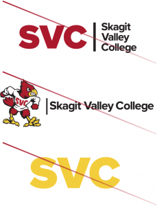
Please don’t abuse, change, or manipulate our logo in any way. Each element and color has its own purpose and we strive to keep our brand solid and consistent. The following are examples of what NOT to do with the SVC College logo:

Sizing
Our logo must always be legible, clear, and concise. In order to do this, we have specific minimum requirements for our logo via print and screen.
Primary Logo
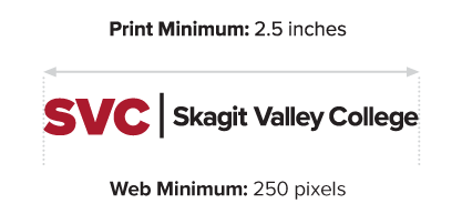
Print Minimum: 2.5 inches | Web Minimum: 250 pixels

Secondary Logo
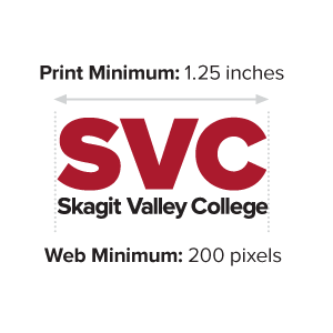
Print Minimum: 1.25 inches | Web Minimum: 200 pixels
